
Stop box-sizing everything
When I audit CSS, I often see stylesheets beginning with box-sizing: border-box. Apply the property to every element is absolutely unnecessary and goes against the shrink-to-fit calculation. Let’s see why!
Many stylesheets begin with:
  html { box-sizing: border-box; }

  *,
  *::before,
  *::after { box-sizing: inherit; }
or worst:
  * {
  -webkit-box-sizing: border-box;
     -moz-box-sizing: border-box;
      -ms-box-sizing: border-box;
       -o-box-sizing: border-box;
          box-sizing: border-box;
  }
The problem is not the * selector that no longer poses performance problems. The real issue here is to apply a property to every elements while only few need it!
What is box-sizing ?
box-sizing tells the browser what the size of an element (width, height, min/max-width and min/max-height properties) should include ; content size only or also paddings and borders. It can receive two different values :
- content-box : the size equals the size of the content default value)
- border-box : content-box + paddings + borders
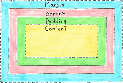
With box-sizing: border-box : padding and border are included - never the margin. The size is calculated by subtracting borders and paddings:
  /*
    Without box-sizing: border-box,
    the width of the content box is 300px,
    the real width of .foo is 342px (300 + 2x20 + 2x1)
  */
  .foo {
    width: 300px;
    padding: 20px;
    border: 1px #000 solid;
    margin: 10px;
  }

  /*
    With box-sizing: border-box,
    the width of the content box is 258px (300 - (20*2) - (1*2),
    the real width of .foo is 300px
  */
  .foo-another {
    width: 300px;
    padding: 20px;
    border: 1px #000 solid;
    margin: 10px;
    box-sizing : border-box;
  }
An important point is to understand that to be effective, box-sizing must be declared jointly with one of the size properties (width, height, min/max-width or min/max-height). For every element without a size property specified, box-sizing: border-box will be ignored. It also means that every inline elements don’t need box-sizing: border-box.
For block elements, if you’re working with a grid, you probably don’t need to set a size for elements inside columns. Means you probably won’t need border-box.
  /*
    Here box-sizing won't do anything,
    because no size property is declared
  */
  .foo {
    padding: 20px;
    border: 1px #000 solid;
    margin: 10px;
    box-sizing : border-box; /* useless */
  }

  /*
    Inline elements don't receive size properties,
    so box-sizing won't do anything neither
  */
  span {
    width: 200px; /* ignored */
    padding: 20px;
    border: 1px #000 solid;
    box-sizing : border-box; /* useless */
  }
note: Firefox accepted a padding-box value but it has been recently removed (04/2016).
When box-sizing: border-box is helping ?
For fluid grids
A grid has columns and gutters. In CSS, width specifies the width of a column and margin (left or right) the width of gutters.
  .column {
    float: left;
    width: 23%;
    margin-left: 2%;
  }
If you add side paddings, you must reduce width :
  .column {
    float: left;
    width: 19%; /* 23% - 2x2% */
    margin-left: 2%;
    padding: 20px 2%;
  }
But working Responsive, it is best to use pixels for paddings because they shouldn’t shrink on small devices (readability concern). As width is in percentage and padding in pixels, you can’t calculate the correct width, like we did in the previous example - unless you use the calc property. Then you need box-sizing: border-box, to include padding inside width :
  /*
   Because paddings are in pixels
   and width in percentage,
   we use box-sizing: border-box
  */
  .column {
    float: left;
    width: 23%;
    margin-left: 2%;
    box-sizing: border-box;
    padding: 20px;
  }

  /*
   The real width of .column is 23%
   and it includes 40px of padding (left + right)
  */
For forms
For input and textarea, when you set width: 100%, the element overflow the layout :
  input {
      width: 100%;
      padding: 10px;
  }
Adding box-sizing: border-box fix it :
  input {
      width: 100%;
      box-sizing: border-box;
      padding: 10px;
  }
Stop overusing width: 100%
We often set box-sizing: border-box because we also set width: 100% which is most of the time not necessary.
A common case is to set width: 100% while working with Media Queries when, for instance, an element is 50% large on large screen devices and 100% on small ones :
  div { width: 50%; }

  @media (max-width: 35em) {
    div { width: 100%; }
  }
Writing it this way is much simpler and allows us to benefit the shrink-to-fit width calculation :
  div { width: 50%; }

  @media (max-width: 35em) {
    div { width: initial; }
  }
The shrink-to-fit width calculation
The width of a block element is the width available in its parent. If we add paddings or borders, the width of the content box will naturally shrink in order, for the element, to keep its width. It is the same behaviour as box-sizing: border-box and it’s called the shrink-to-fit width calculation.
Calculation of the shrink-to-fit width is the width of the containing block minus the used values of side margins, paddings and borders and the widths of any relevant scroll bars.
The code below demonstrates how code is simpler when not using width: 100% and then get benefit from the shrink-to-fit width calculation:
  div {
    width: 100%;
    box-sizing: border-box;
    padding: 10px;
  }

  /* is the same as : */
  div { padding: 10px; }
To use or not to use it ?
Few points that might helps :
- Use it, when the element is a grid column
- Use it, when width and padding or borders are set (the less we set width the better)
- Use it, when a form field needs a full-width
- Don’t use it for inline elements
- Don’t use it with
width: 100%, usewidth: initialalone instead
tl;dr
When you don’t need it
- for element without width or height (or min/max-width, min/max-height) set
- for inline elements
When you might need it :
- column’s grid
- inputs and textareas